Project Description
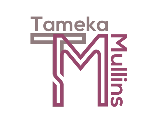
Here is the logo I designed for an author with a longtime presence on the Web. She was looking for something that was simple and modern to match her writing style/personality.
I discovered the font I used for the "TM" in my Photoshop collection (Sportrop). I thought the continuous line forming the letters resembled the maze-like lines you would find in circuit boards. Plus, the "T" and "M" letters looked pretty neat layered on top of one another in the same spot for an overlapping effect and could stand on their own as a logo without the text next to it.
However, I decided to lay out my client's name on the upper right corner and match the colors to their respective letter for a more unusual logo option. I enjoy the eventual square layout to this logo because it's different from the rectangular layout I usually employ with designing logos and I believe it embodies the modern aesthetic my client was looking for.