
I was referred to an acquaintance of a former client who initially needed some web editing for her new business’s web site, but she also expressed a desire for a new logo to go with it. She is a publicist in the music industry who has branched out with her own PR firm called Identity PR.
As a logo, she wanted something minimally sophisticated that emphasized what her business is all about, pointing to Donna Karan’s fashion logo as a primary example of what she was looking for. Ideally, a logo that was typography-based and can translate well in print and on the Web.
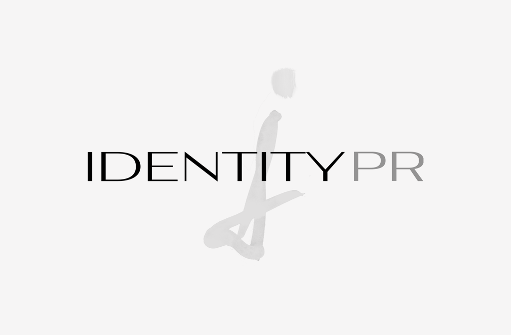
So after some brainstorming, I came up with an “I” image made by watercolor brushstrokes to resemble cursive or a calligraphic signature. It also resembles music symbols like a treble clef to reference her music industry credentials.
The text is the same font as the one used in the Donna Karan logo (Aviano), but done in two-tone colors to show 2 words in the title, and I superimposed it on top of the “I”. This design merges the minimal sophistication with a distinctive visual to keep the logo from looking too generic.
Click here to visit Identity PR online.